Duo-Side
A Duolingo inspired wellness app designed to help Berea College students manage academics, work-study, and daily habits through simple, achievable actions.
Role
UX/UI Designer
Industry
Health & Fitness
Duration
3 months

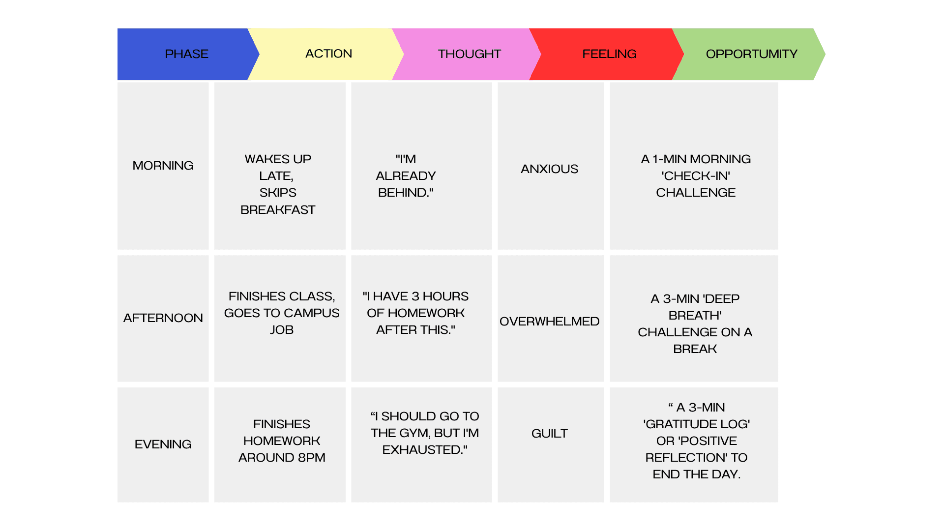
User Journey
After our interviews, we then mapped out a typical Berea student’s daily routine to identify stress points and opportunities for micro-wellness actions.
Sketches
We translated research insights and persona needs into low-fidelity wireframes, focusing on the core flows: onboarding, daily challenge presentation, check-ins, and rewards.
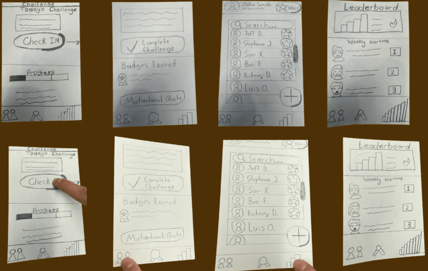
Cognitive Walkthrough
After the paper prototypes, we ran a peer testing session with classmates and our professor. We asked users to complete simple tasks like:
Sign up for an account
Complete their first challenge
Find the leaderboard
Key Insights
Login vs. Guest Mode:
Several testers preferred a “Get Started” option before committing to an account, so we added it.
Guiding the User’s Eye:
The main call-to-action wasn’t clear enough; we improved the button hierarchy and color contrast.
After iteration, we moved to another low-fidelity wireframe** and refined the experience.
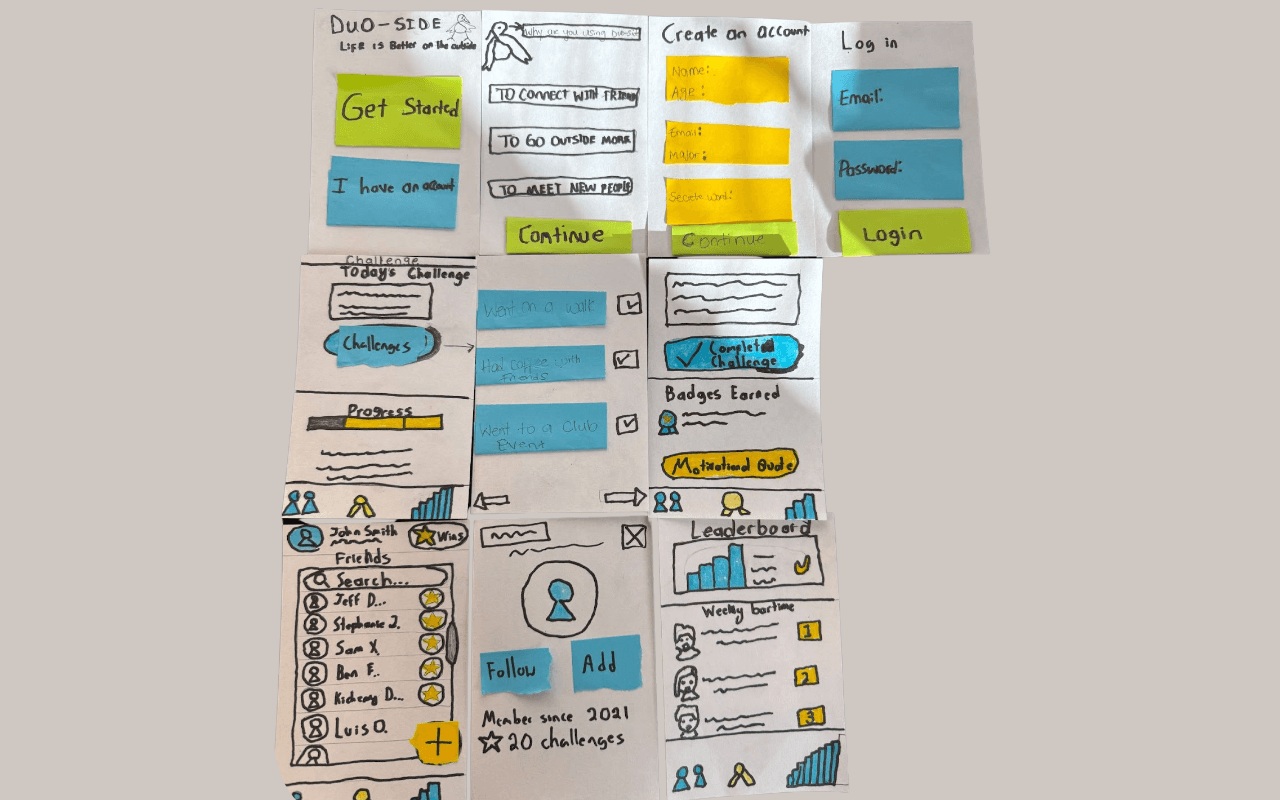
Usability Testing
With the new low-fidelity digital prototype, we conducted usability testing sessions with five Berea students who had not previously seen the design. I gave them three specific tasks:
Sign up for an account (or Get Started).
Find and 'Check In' to the day's challenge.
Find where their earned badges are stored.
This testing showed us what we fixed and what was still broken:
Success (The Fix Worked): All 5 users successfully navigated the new entry flow. The 'Get Started' button was a clear success, with 3 users choosing it immediately.
New Issue (Confusing Navigation): We have identified a new problem. When asked to find their badges, 4 out of 5 users either tapped 'Profile' or hesitated for a long time. They did not understand that the 'Trophy' icon in the navigation bar meant 'Badges.'
Iteration (The Solution): Based on this clear feedback, we made an immediate change to the wireframe. I replaced the ambiguous 'Trophy' icon with a clearer 'Leader Board' icon and added a text label, which solved the confusion in later tests.
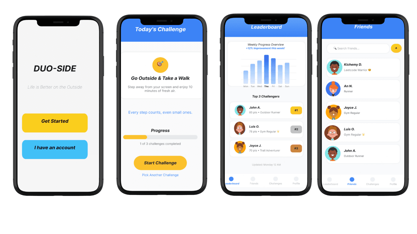
Live Prototype
Since this was a class project with a tight deadline, we moved directly into creating a high-fidelity wireframe in Figma. By this stage, we had already gathered valuable feedback from earlier sketches and peer testing, giving us a clear sense of our visual direction and user flow.
This allowed us to focus our time on designing an engaging, functional prototype that brought our concept to life.
Reflection
The biggest personal challenge was removing my own bias. As a Berea College student myself, I fit the user profile perfectly. I had to make a constant, conscious effort to 'stop designing for myself' and trust the data from our user interviews and tests, especially when their feedback contradicted my own assumptions. This project truly taught me the difference between empathy and projection.
If I were to continue working on this class project, I would partner with the Berea College Wellness Center to co-create new challenge packs. This would add expert-approved activities for different needs (e.g., 'Study Stress,' 'Physical Activity,' 'Mindfulness') and add more credibility to the app's content. The current app is tailored specifically to the Berea College experience (mandatory work, small community). A major future step would be to broaden the app for all college students. This would require a new research phase to understand the unique stressors of students at different types of institutions (e.g., large public universities, community colleges) and then generalizing the app's content to be universally helpful
Cognitive Walkthrough
After the paper prototypes, we ran a peer testing session with classmates and our professor. We asked users to complete simple tasks like:
Sign up for an account
Complete their first challenge
Find the leaderboard
Key Insights
Login vs. Guest Mode:
Several testers preferred a “Get Started” option before committing to an account, so we added it.
Guiding the User’s Eye:
The main call-to-action wasn’t clear enough; we improved the button hierarchy and color contrast.
After iteration, we moved to another low-fidelity wireframe** and refined the experience.
Usability Testing
With the new low-fidelity digital prototype, we conducted usability testing sessions with five Berea students who had not previously seen the design. I gave them three specific tasks:
Sign up for an account (or Get Started).
Find and 'Check In' to the day's challenge.
Find where their earned badges are stored.
This testing showed us what we fixed and what was still broken:
Success (The Fix Worked): All 5 users successfully navigated the new entry flow. The 'Get Started' button was a clear success, with 3 users choosing it immediately.
New Issue (Confusing Navigation): We have identified a new problem. When asked to find their badges, 4 out of 5 users either tapped 'Profile' or hesitated for a long time. They did not understand that the 'Trophy' icon in the navigation bar meant 'Badges.'
Iteration (The Solution): Based on this clear feedback, we made an immediate change to the wireframe. I replaced the ambiguous 'Trophy' icon with a clearer 'Leader Board' icon and added a text label, which solved the confusion in later tests.
Live Prototype
Since this was a class project with a tight deadline, we moved directly into creating a high-fidelity wireframe in Figma. By this stage, we had already gathered valuable feedback from earlier sketches and peer testing, giving us a clear sense of our visual direction and user flow.
This allowed us to focus our time on designing an engaging, functional prototype that brought our concept to life.
Reflection
The biggest personal challenge was removing my own bias. As a Berea College student myself, I fit the user profile perfectly. I had to make a constant, conscious effort to 'stop designing for myself' and trust the data from our user interviews and tests, especially when their feedback contradicted my own assumptions. This project truly taught me the difference between empathy and projection.
If I were to continue working on this class project, I would partner with the Berea College Wellness Center to co-create new challenge packs. This would add expert-approved activities for different needs (e.g., 'Study Stress,' 'Physical Activity,' 'Mindfulness') and add more credibility to the app's content. The current app is tailored specifically to the Berea College experience (mandatory work, small community). A major future step would be to broaden the app for all college students. This would require a new research phase to understand the unique stressors of students at different types of institutions (e.g., large public universities, community colleges) and then generalizing the app's content to be universally helpful
Other projects

Reusable Sanitary Pads
Led product design and management for a reusable sanitary pad supporting girls in underserved Liberian communities.

AI vs. Human Vision
Interdisciplinary Research on Artificial Intelligence

Focus Timer Robot — Arduino, C++, Electronics
A distraction-free hardware timer designed to support student focus and productivity.
Interested in connecting?
Open to Product, UX, and SWE internship roles or even just a friendly conversation or feedback on my portfolio. I’d love to connect!
Interested in connecting?
Open to Product, UX, and SWE internship roles or even just a friendly conversation or feedback on my portfolio. I’d love to connect!
Interested in connecting?
Open to Product, UX, and SWE internship roles or even just a friendly conversation or feedback on my portfolio. I’d love to connect!